The client
Crown Jewelry

Services
Technology Stack
The Challenge
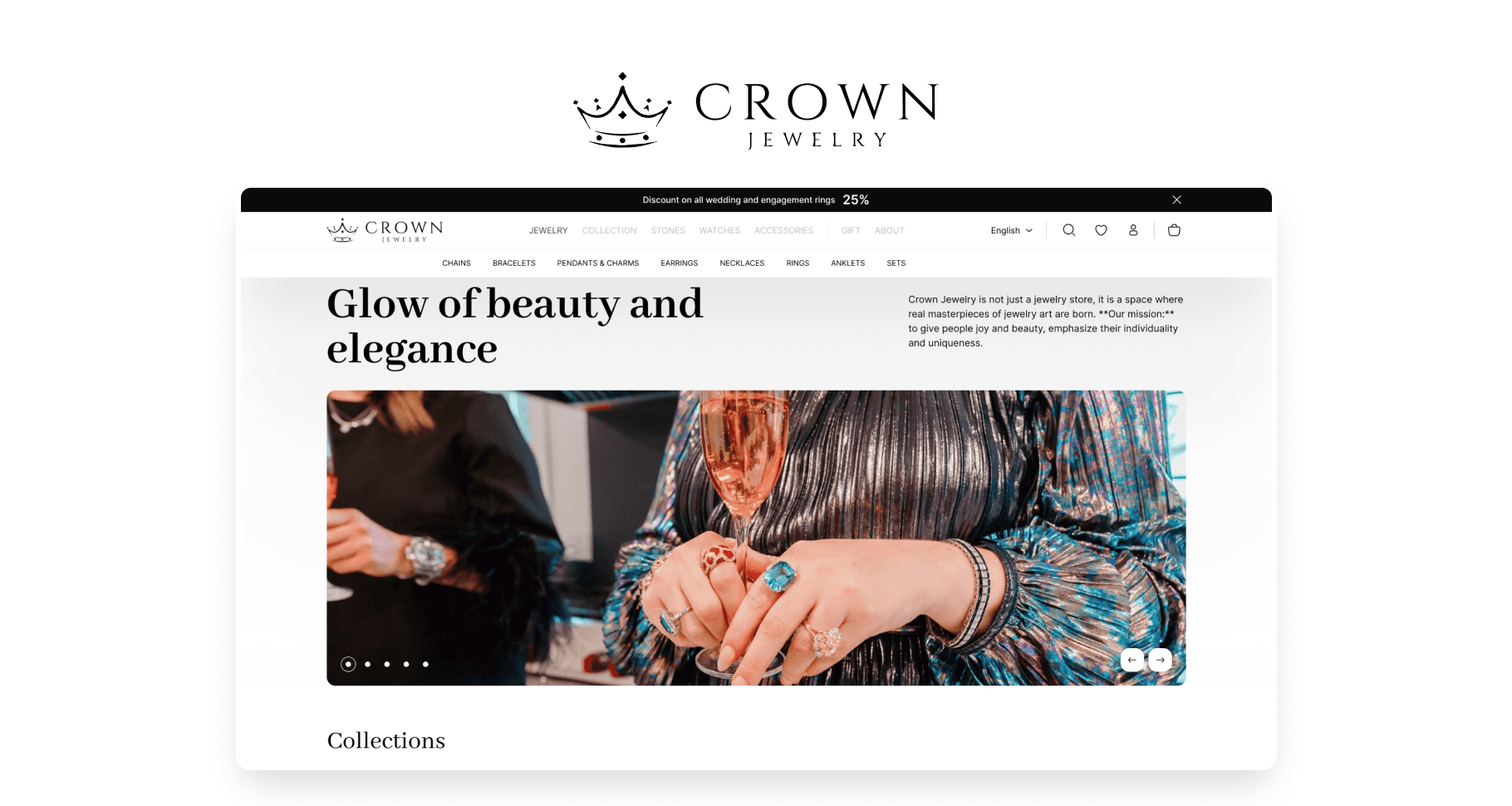
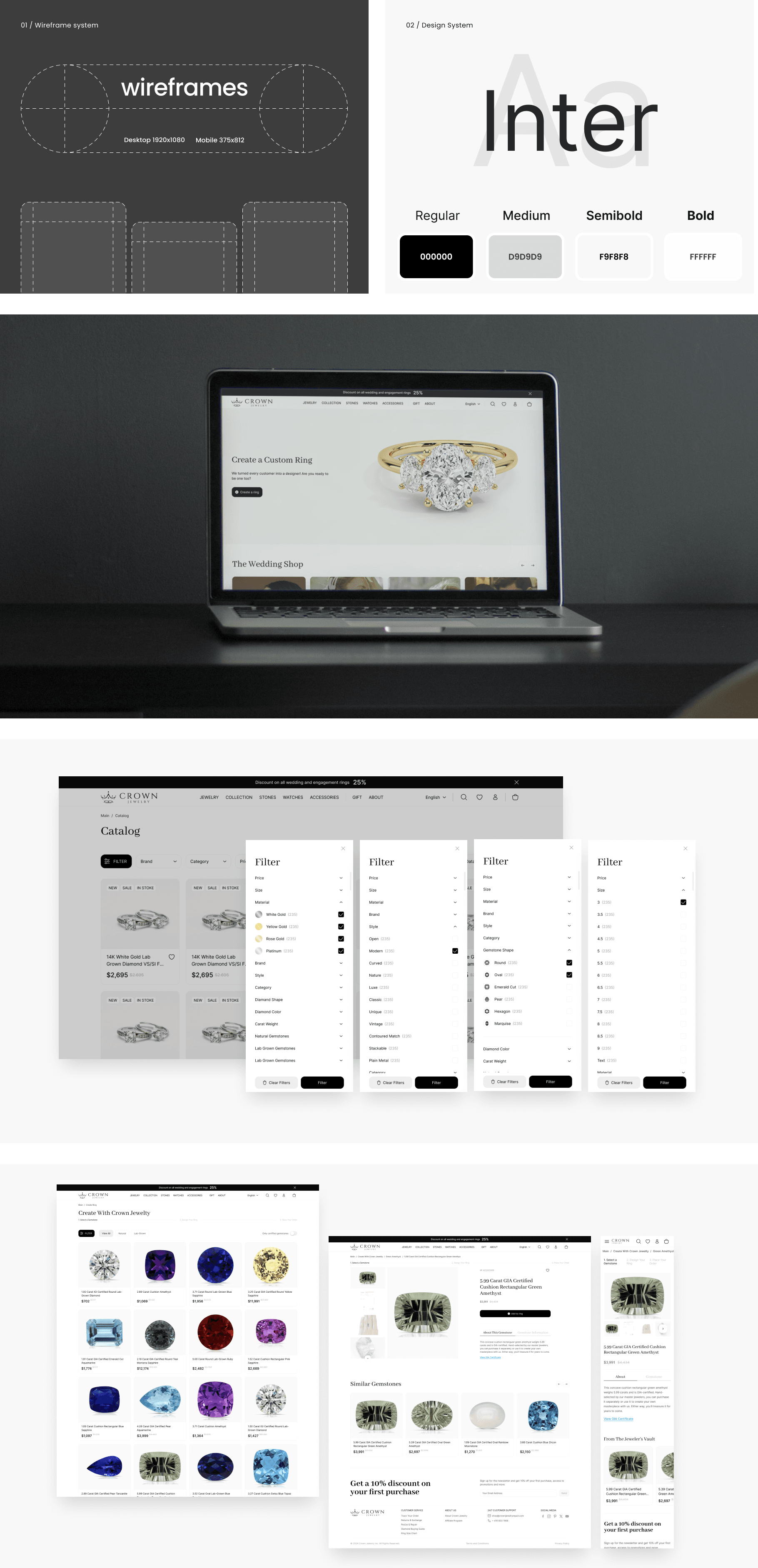
The design of the online jewelry store, by the references provided by the client, includes the following pages:
Home Page. The home page is designed to immediately capture the attention of visitors to the most important aspects of the store. It includes a stylish slider with new arrivals and promotions.
Popular categories block. Allows quick access to the most popular sections of the catalog.
Catalog Page. The catalog page is designed with convenient navigation and product search in mind.
Filters and sorting. Allow easy searching for jewelry by category, price, material, and other parameters.
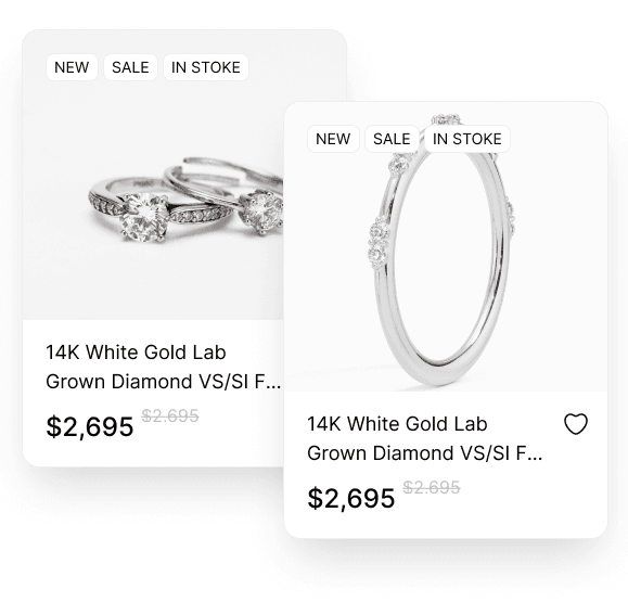
Product grid. Images of each product with a brief description and price.
Quick view option. Allows viewing product details without navigating to a separate page.
Product Page. The product page contains all the necessary information for making a purchase decision: Large images with zoom: Show product details.
Product Description. Includes information about materials, sizes, and features.
Interactive constructor. Users can choose the type of product (e.g., ring, bracelet), materials, inlays, and other details.

The Outcome
The developed design of the online jewelry store combines aesthetic appeal and high functionality, providing a pleasant user experience and promoting sales growth. Each page and feature has been carefully thought out to meet the needs of modern buyers and enhance the store's competitiveness in the market.